The true origin of the word “Paaras” is not known, but it is widely believed to be from Indian mythology. The word has many meanings, but the most widely recognised version, and the one that represents and encapsulates our purpose and focus, is the reference to the mythical touchstone, one that converts any base metal to gold at a touch.
That in a nutshell is our value proposition to clients, to partner them in helping realise their business ideas, goals, and ambitions. And its rhyme with the word 'parous' denotes the fruits of these partnerships.
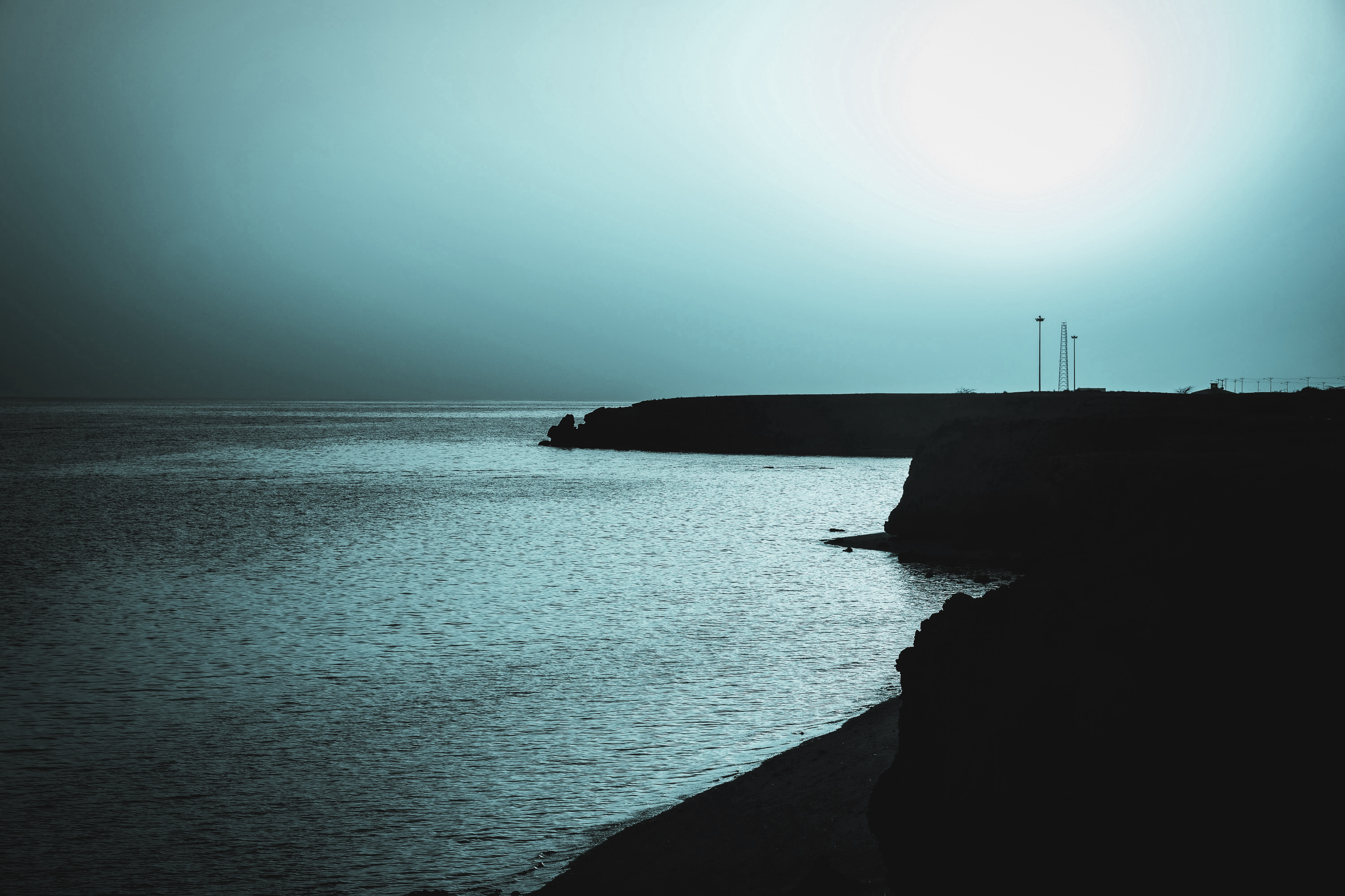
The rest of the name “Marine Solutions” identifies our core competence and focus. Thus, Paaras Marine Solutions is a name to rely on for dependable, high-quality marine solutions.

The logo is an abstract, minimalistic form, created to symbolise a ship delicately balanced on a wave.
The inverted triangle denotes the tip of a pencil, symbolic of design and innovation, while the inverted 'V' shapes within the triangle represent 'Lambda' in uppercase, the Greek letter for land. The complete logo is an amalgamation of land and water, in other words, the Coastline and Beyond.
The golden colour in the brand palette has been inspired from the name of the company, Paaras, which as explained above refers to a mythical stone with the ability to convert any base metal to gold. The blue stands for water in literal representation, and stability, inspiration, and wisdom in a more philosophical representation.
Your brand is a promise to your clients... of quality, consistency, competency, and reliability. JASON HARTMAN